To enhance my understanding of thriller films, I am researching opening sequences from different thrillers to recognise what makes them good and what editing, camerawork, mise - en -scene and soundtrack have been used to hopefully give me ideas and inspiration for when I make my own thriller opening.
The following is the link for the opening sequence of Captain America:The Winter Soldier

This is the opening shot, as the audience can see the director has deliberately decided to open on a plain black screen accompanied with the titles in a contrasting white colour so that they really stand out. Moreover, the choice of font is crucial - it is a basic but strong formal font with the names of the directors being large, bold and all in capitals, the effect of this is the opening titles capture the audiences' attention.

Equally, the next title that appears is very similar to the first, except that it is the opposite colour combination this time, from these two preliminary titles the audience gets a sense that these two colours, black and white are going to be of significant importance throughout the film. To the same extent the audience can consider the connotations that the colours black and white hold within the thriller, and many other film genres; for example, black is a colour that is typically associated with darkness, evil, antagonists whereas the colour white is often a signifier of light, purity, goodness and protagonists - therefore instantly in using these binary opposites, the director has set up a sense of the conflict between good and evil just through the opening titles.

Within this shot there is again the main two colours; black and white, there is however also a third colour introduced - the colour red. The colour red strongly holds the connotation of danger but also of leadership, war, strength, power, determination and courage - all of these associations indicate to the audience what is to come from this film. The audience also notices the introduction of stars, the film is called "Captain America" and as stars are a major part of the American flag, the audience deduced that this is all part of the patriotic iconography.

This title shot introduces the first character to the audience, from the shield and the letter A on the characters hat the audience can make the assumption that this is the characterisation of Captain America. It is interesting that the director has decided to use a comic - book style representation of the characters in the opening sequence as the film is based upon the original Marvel Comic Books, 'Captain America' with the addition of other Marvel characters such as Black Widow, Falcon and Nick Fury. It is important that Captain America is the first character introduced as he is then instantly identified as the main protagonist.

Typical contrast of black and white, the image is very similar to the coat of arms of the United States of America, especially the reference to the bald eagle, this image represents S.H.I.E.L.D., the force of good and is yet another reference to America and what it stands for.

This title is showing the clear divide between good and bad, protagonist and antagonist by having a physical divide between the two, identical in everything but colour and the difference in emblem of S.H.I.E.L.D.'s signature emblem containing the bald eagle and Hydra's skeletal octopus. The divide between the characters is also a signifier of their moral status, S.H.I.E.L.D is high on the divide, a usual association with heaven, whereas Hydra is on the opposite side below the line, often associated with hell - another intentional image for the audience.

This title is fairly simplistic but still effective, the focus being more on the image than the actual title itself.


This title shot is interesting as the military planes again connote that war is a major theme within the film and the planes are very similar, all in line and are equidistant connoting unity and teamwork.


Within the shot the audience can observe the outline of what appears to be the cogs for a clock, again this could be a signifier of teamwork, however the audience can see a octopus tentacle to the left of the frame - the octopus being the icon for the antagonists, collectively known as Hydra, from this the audience can deduce that there is unity among the antagonist team, posing a greater threat to the protagonists.

Emblem of antagonists, 'Hydra' all in red, this is very telling as the audience often associates red with danger.

In this long shot the American flag is presented as the tunnel, more iconography that is indicative of what is to come later in the film, Captain America the main protagonist is shown running forward in an attack stance, shield forward connoting his ability to protect.

This mid shot shows the main protagonist, closer up and in more detail - it is focusing on the action of the shot, especially Captain America's shield which has a white rim, a colour associated with goodness shattering the black lines, black typically a symbol of darkness and evil, this colour and image association connotes to the audience that Captain America (good/ light) will over power the Hydra, the antagonist (bad/darkness) .

The shot then moves out to this long shot, showing the entirety of the frame and highlighting Captain America's fighting stance.

This shot acts as a bridge, as the shield becomes the focus which then transcends across to the following shots as it allows the directors to create a new sequence moving on from the previous images shown.


This sequence shows the main characters to the audience and introduces the actors and actress' that star in the film, the images used are no longer cartoon figures but are the outlines of the characters in the film - Chris Evans/ Captain America comes first as he is the primary protagonist. Equally, the symbolic use of white remains constant throughout the sequence.

This image again, similarly to the previous shot identifies another main character - her outline is all in white a strong indicator to the audience that this character is in fact a protagonist.

This shot is introducing a main character, although this character is filled with black and this implies to the audience that he is an antagonist.

This shot introducing the character of Falcon instantly identifies him as an antagonist, despite having a black silhouette due to the wings the character has - wings often being associated with angels; a force of good.


This shot identifies the character as a protagonist as the director has intentionally placed the emblem on the side of the character's shirt, showing that he is a member of S.H.I.E.L.D and is therefore good.

The director has decided to show many of the women introduced in the titles as holding guns, conveying that they are not weak and are able to defend themselves, subverting the stereotypical portrayal of women as being 'damsels in distress' and connoting that women will play an important role in the film.

Within this title, the character is presented as at the top of the compass, pointing North and implying that they are a in control, trustworthy and a protagonist.


This title shows the character to be in a position of power as the image behind is that of a map, indicating to the audience that S.H.I.E.L.D. is a global organisation, furthermore America is especially highlighted on the map as it is clearly visible and this is yet another indication to the audience that the action of the film is centred around America.

This shot acts as a transition to the next sequence.

This title shows the character to be of significant importance as a protagonist, as not only do they have the S.H.I.E.L.D. emblem behind the silhouette, but a big image of the American flag also to convey the character's allegiance to Captain America and S.H.I.E.L.D. Moreover, this character is portrayed as important as not only is the name of the actor presented but of the character, 'Alexander Pierce' as well.
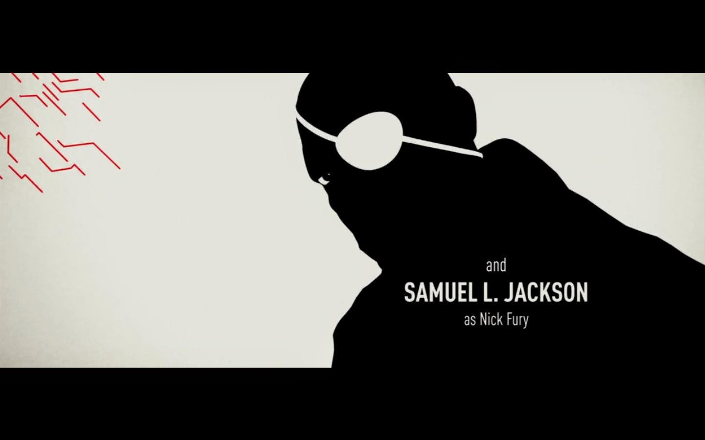
Equally, like the previous title shot, this character is also presented as being important, the name of both the actor and the character appearing. Nick Fury is shown to be a protagonist, despite the black silhouette due to the white eye patch , a colour used by the director in nearly every shot to convey goodness.

The company who have produced the film is presented last, being the final acknowledgement of involvement of the film, moreover the name 'Marvel Studios' is large in a more formal print to stand out to the audience, this is helped by the conflicting black and white background and font colour.

Finally, this is the last title shot - a close up of Captain America's shield, a final signifier of the fighting and action to be anticipated from the film. Moreover, the font is the largest of the whole sequence and is in a bold, military, eye - catching style to ensure the audience remember the name of the film.
Soundtrack
The soundtrack for Captain America, like the other thriller opening I researched consists of non - diegetic, swelling, orchestral music which builds throughout the piece. The consistent, strong, drum baseline builds tension throughout for the audience and connotes a sense of danger. Moreover, the string instruments and brass instruments which are predominantly heard create a minor sound to the piece, this is synchronous sound - the disjointed tune matching the images of the antagonists in the sequence creating a strong sense of foreboding.
Sources: Wiki, artofthetitle.com, colour-wheel-pro.com,
No comments:
Post a Comment